Produgie - Gain active users through Redesign Produgie Sprint

Produgie Sprints allow individuals to practice and achieve outcomes with guidance. However, switching devices, onboard issues, and lack of motivation, which causes low active users. Therefore, I revamped whole user experience by redesigned the Sprint from 0-1, including the onboarding, check-in process, and user analytics, that increased the active user rate.

  • My role: I am the main UI/UX in-house designer, working with multiple cross-functional teams, including the CEO, CPTO, PO, customer support, and 8-9 developers.
  • Design phase: Define, Discover, Deliver
  • Platform: Website platform
  • Tools: Figma, Miro, Illustrator
  • Timeline: April to June 2022 (3 months)
  • Context:
    User research, User journey map, User flow, Functional map, Wireframe, Mock-up, Prototyping, Demo

Project Background

A Produgie Sprint is a tool that allows individuals to take action and practice behaviors, conduct weekly self-checks, and receive feedback from Sprint crew members, to achieve outcomes in a short period.

Business Problem

Low Active Users

Less than 1% of users proactively using Produgie Sprint

Only 1% of users access Sprint via mobile screen

Sprints were designed only for mobile screens. 99% of users use a desktop instead of a mobile according to Google Analytics data.

90% of users raised issues with Sprint onboarding

From our customer support email, the key issue is that interrupted user flow confuses them.

Almost 0% of user proactively start their second Sprint

Business Goal

“Improve active user rate that is barely there”

Key success measurement:

  • Reduce user churn by 20% from the start to the end of the sprint.
  • 50% of users are able to onboard their Sprint independently.
  • Increase returning user rate to 5%.
Explore Issue

The confusions from original design

Highlighted the problems and key purpose from the current product.

  • When users first land on a Sprint page with an unfriendly UI, they don't know what to do.
  • There are two pages from different perspectives but with a same purpose that also confuse the user.
  • There is no hierarchy for each screen, that make user difficult to find out the key action.
Define Problem

The poor usage experience and the flow stop the user from executing the Sprint

I collected feedback from customer supporters, interviewing current users and becoming actual users.

After analysed feedback and drew down a User Journey Map, I listed the user problems, expectations, and highlighted the most confusing phase.

Overall, users love the periodic Sprint Crews feedback.
“I think it's very helpful from the feedback my Sprint Crew gave me"

Highlighted pain points are:

  • The interrupted usage flow: Users don't know what or how to do, or where is the information when onboarding the Sprint and doing weekly check-in.
  • The screen function is unclear: The repeated UI component and unclear purpose of the button confused them.
  • Inconsistency of the visual screen and component: The mobile screen is hard to use because the item is so small. The content lack of priority with misleading colours.
  • The Terminology is oversimplified: The unknown abbreviation, and small font size are unable to read.
  • Lack of system operation feedback: User couldn’t find the button, led by the fact that they are hidden with no interaction feedback or safety mechanism.
  • No motivation to complete the Sprint: User often missed the check-in date and feel Sprint takes a lot of effort out of their work.
    “I am too busy at work and don’t think this reduces my workflow.”

Furthermore, from the backend data and user interviews, we found out that the user doesn’t use the “User Analytics” that should monitor their Sprint progress.
“I am not sure about this data, but I hope it helps my progress”
The assumption is that users don't understand the meaning of user analytics data because it didn't displayed visually and intuitively.

I narrowed down the problem scope by focusing on what causes the worse user experience that leads to the low active user rate, and transformed the problems to design goals:

How Might We “Redesign a Sprint for easy onboarding to provide impact constantly?”

Discover Idea

Ideation on transforming self-reflection thinking into flows

For Check-in flow, I studied how other platforms and experts lead the conversation to guides others, which would help to design guidances, leading users during their check-in reflections.

Kanban board that combine with work management function

In order to understand how to improve the working outcomes through Produgie Sprints, I interviewed people to understand how they manage working tasks and form daily habits. And incorporating the idea of managing and tracking tasks, as these are common behaviors.

Insights:

  • Manage the daily to-do check list.
  • Plan ahead at the start of the day, and keep track on the progress.
  • Set weekly goal.
  • Constantly raise and solve blockers.d component

Analysis graphs that help user focused on self progress

Based on our current API, my team and I discovered all possibility to display the analysis graphs, and extract the key useful charts in a workshop.

Questions to help us define and focused on the right data:

  • How is the relationship between actions, behaviours, and outcomes?
  • Is the 2-by-2 matrix help improving user’s progress?
  • How to make people feel create new activities is helpful?
  • What data and how can we track people's progress?
Design solution 1

Guiding assistance to help reflecting on self-development

We came out with the ideal Sprint flows that address what users will go through, combination flows of Onboarding, Check-in, Final Review, and Sprint Crew feedback.

As part of the weekly Check-In reflection process, the Produgie Assistant on the left panel will guide the user through various screens. This will facilitate interaction with the reflection process, allowing the user to view their previous progress, feedback, and planned activities to improve.

Design solution 2

Kanban board enable user to simply execute and practice activities

I created colors for actions to help recognize and compare multiple activity cards. With the combination of the Sprint practice and working task, the user will be able to track and manage their progress in To-do, In progress, and Done statuses.
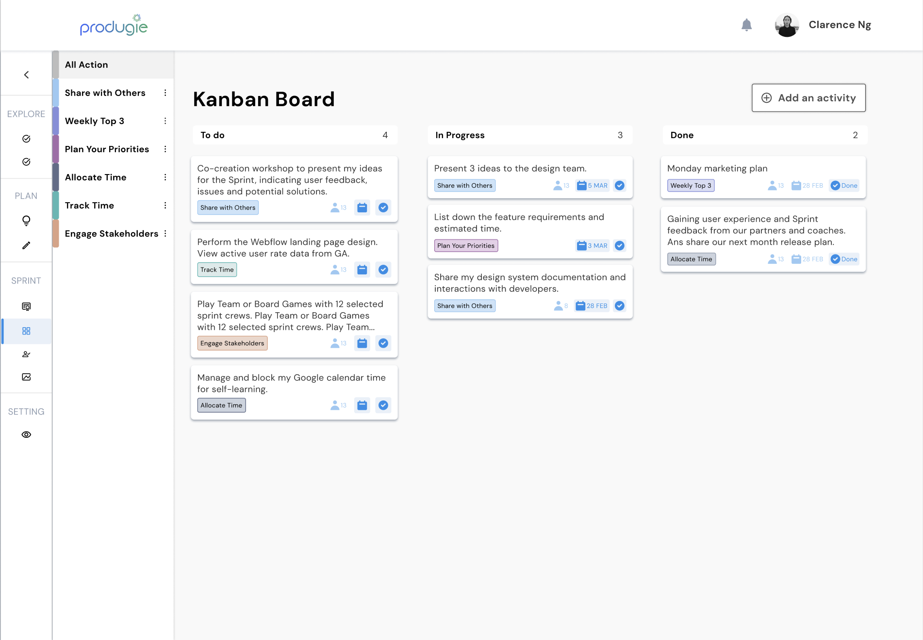
Interactive design of activity card UI
Design solution 3

Quick add To-do list for reminding of behaviours and outcomes while working

In order to allow the user easy to remind, we created Quick add To-do list for reminding of behaviours and outcomes. (v2)

Design solution 4

Practical data for user analytics that drive encouragement

Leading sentences help users understand and reflect on their data. The user can even compare themselves to everyone to see gaps for improvement. (v1)

Prioritize the key information. Insights with the visual color face, progress trend, and suggestions from the data results. (v2)

Result and future enhancement

Great impression from Sprint Product Demo with our worldwide customers

Walkthrough product demo sessions for our core customers based in the US, Indonesia and Malaysia, and they were impressed with how proactively we are working to improve the User experience.
We receive a lot of praise and impressive from our customers.  We have reduced 30% of the user questions and improve the user rate by them holding an event for executing their Sprint.

Future enhancement:

  • Ensure that the interaction before and after the Sprint process is connected with users to reduce drop points.
  • Extend to Team Sprints by focusing on Team Managers to help grow their teams.
  • Enhance Sprints by creating more interrelationships with different roles and gain more insights by helping to develop capabilities and reduce workload.

Business Problem

Low Active Users

Less than 1% of users proactively using Produgie Sprint

Only 1% of users access Sprint via mobile screen

Sprints were designed only for mobile screens. 99% of users use a desktop instead of a mobile according to Google Analytics data.

90% of users raised issues with Sprint onboarding

From our customer support email, the key issue is that interrupted user flow confuses them.

Almost 0% of user proactively start their second Sprint

Copyright © Tiyu Su